::Color Play::
My Flying Colors Blanket has taken "flight". In fact, just today one of my testers shared with me her color grid that she worked up for her own Flying Colors...
I love the beautiful complimentary shades
of purple and yellow she has chosen and I can't wait to see her finished blanket. (Thanks, Susie, for sharing!) Isn't color just so terrific!
The other day I was helping my hubby select colors for his new website design and we came across a really terrific website called Color Scheme Designer here. Wowza! What FUN a color-crazed girl could have there--or even someone who likes more muted tones than I. Take a peek and play a little. Seriously, play! It is so delightful, and it might be just the ticket for you in designing your own Flying Colors scheme or helping you figure out your home decor color palette.
I love to see other people's translation of my patterns in different color schemes. It's fascinating to me how the color can so drastically affect the appearance and "mood" of the piece.
Let's start with one that is more subtle, though. Take my Waikiki Wildflower Blanket. Here are my original colors...
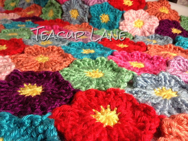
And here are the colors worked up by Sandy at Teacup Lane...
Although they are similar, the pop of red and purple in Sandy's scheme along with the more subtle pink,green, and orange makes for a slightly more vintage look.
Now for a more drastic example. Remember my Paintbrush Pillow?
The two above look somewhat similar with the alternating color/white. But even they change from a more classic "Cath Kidston" look to a more youthful neon look.
Now check out the difference in the two Paintbrush interpretations below.
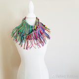
This one--worked up in the same pattern but as a cowl--with a long-run color stranding yarn almost looks like it was painted with watercolors...
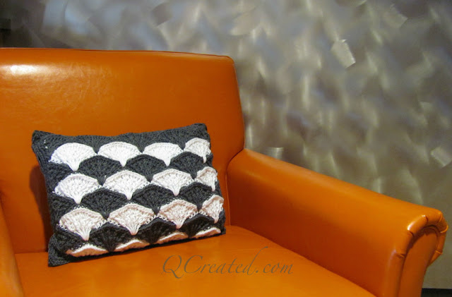
...while this one in graphic charcoal and white is very modern, crisp and clean. Pretty cool, huh?
Finally, the Dit Dah Blanket with its original color design...
Compared to this "fruity" colored version here.
Speaking of color--I came across this little watercolor I painted one day with my daughter many years ago. We were just doodling and creating--something we did a lot of when she was wee.
Next time, look for a little sneak peek of my new design. I can hardly contain the excitement! It is sooooo ME! And yes, it is
C O L O R F U L !
{On the Board} -- Is prayer your steering wheel or your spare tire?
--Corrie ten Boom
I love the beautiful complimentary shades
of purple and yellow she has chosen and I can't wait to see her finished blanket. (Thanks, Susie, for sharing!) Isn't color just so terrific!
The other day I was helping my hubby select colors for his new website design and we came across a really terrific website called Color Scheme Designer here. Wowza! What FUN a color-crazed girl could have there--or even someone who likes more muted tones than I. Take a peek and play a little. Seriously, play! It is so delightful, and it might be just the ticket for you in designing your own Flying Colors scheme or helping you figure out your home decor color palette.
I love to see other people's translation of my patterns in different color schemes. It's fascinating to me how the color can so drastically affect the appearance and "mood" of the piece.
Let's start with one that is more subtle, though. Take my Waikiki Wildflower Blanket. Here are my original colors...
And here are the colors worked up by Sandy at Teacup Lane...
Although they are similar, the pop of red and purple in Sandy's scheme along with the more subtle pink,green, and orange makes for a slightly more vintage look.
Now for a more drastic example. Remember my Paintbrush Pillow?
The two above look somewhat similar with the alternating color/white. But even they change from a more classic "Cath Kidston" look to a more youthful neon look.
Now check out the difference in the two Paintbrush interpretations below.
This one--worked up in the same pattern but as a cowl--with a long-run color stranding yarn almost looks like it was painted with watercolors...
...while this one in graphic charcoal and white is very modern, crisp and clean. Pretty cool, huh?
Finally, the Dit Dah Blanket with its original color design...
Compared to this "fruity" colored version here.
Color speaks to me, as it does to many people. But I've learned that not all folks "feel" it the way I do. I consider it a wondrous blessing to see and enjoy color! I am grateful for color every day of my life! Soon, maybe next post, I will share with you the gift of color in my daughter's life. Pretty cool story, I tell ya! Can you say, "SYNESTHESIA?" If not, check back and I'll explain.
Speaking of color--I came across this little watercolor I painted one day with my daughter many years ago. We were just doodling and creating--something we did a lot of when she was wee.
Nothing amazing, but a pretty typical color scheme for me. Anyone surprised?
So, I ask myself, "Self, since this funny little painting makes you happy, why has it been tucked away in some silly drawer for all this time. It must be where you can enjoy its amateurish but Sueish flair."
It needs a frame. Good excuse to head off to the thrift store...AGAIN!
Next time, look for a little sneak peek of my new design. I can hardly contain the excitement! It is sooooo ME! And yes, it is
C O L O R F U L !
{On the Board} -- Is prayer your steering wheel or your spare tire?
--Corrie ten Boom

